
Spruce
Spruce
Spruce
Spruce
Spruce
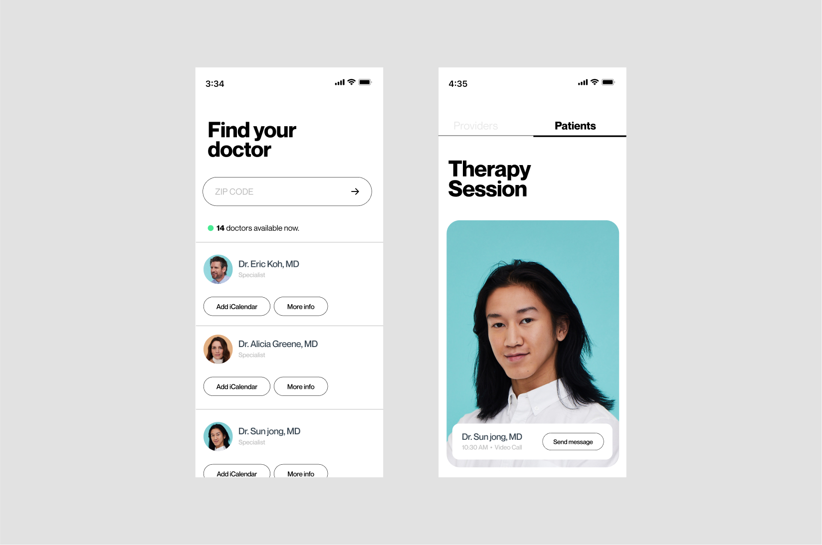
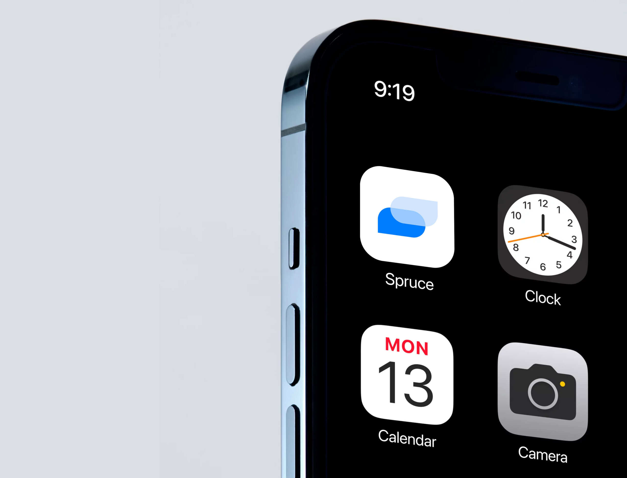
Spruce Health is a cloud-based telemedicine platform designed to help healthcare professionals and clinics communicate with patients via text, video or audio communication. Key features include workflow automation, secure file sharing, rotation scheduling, call forwarding, electronic payments, analytics, and reporting. I was invited by the internal design team to collaborate on the branding redesign from the ground up.
Spruce Healthcare is a cloud-based telemedicine platform designed to help healthcare professionals and clinics communicate with patients via text, video or audio communication. Key features include workflow automation, secure file sharing, rotation scheduling, call forwarding, electronic payments, analytics, and reporting. I was invited by the internal design team to collaborate on the branding redesign from the ground up.
Spruce Health is a cloud-based telemedicine platform designed to help healthcare professionals and clinics communicate with patients via text, video or audio communication. Key features include workflow automation, secure file sharing, rotation scheduling, call forwarding, electronic payments, analytics, and reporting. I was invited by the internal design team to collaborate on the branding redesign from the ground up.
Creative Director→ Hannah Benicio
Visual Design→ Elvis Benicio
Photography → Gia Goodrich
Motion → Tayssa Marques
Creative Director→ Hannah Benicio
Visual Design→ Elvis Benicio
Photography → Gia Goodrich
Motion → Tayssa Marques
Creative Director→ Hannah Benicio
Visual Design→ Elvis Benicio
Photography → Gia Goodrich
Motion → Tayssa Marques
website


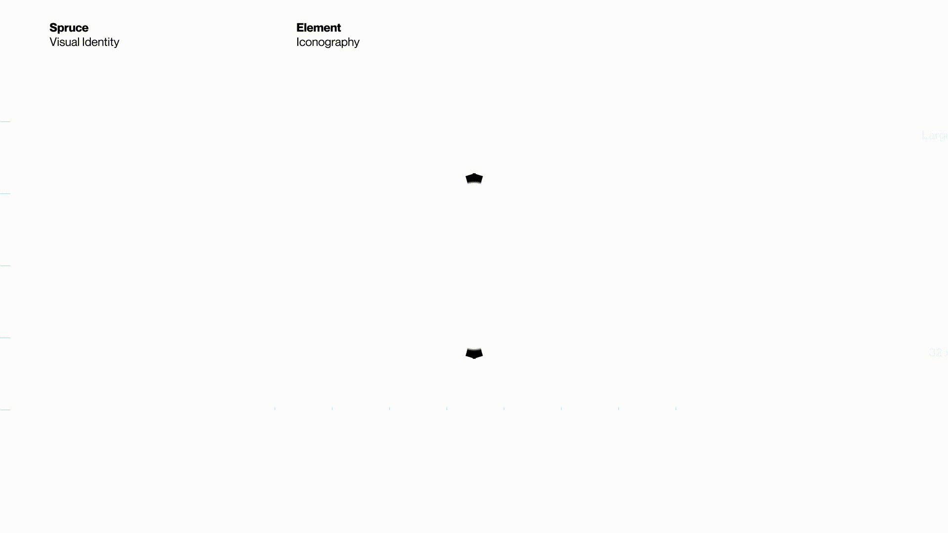
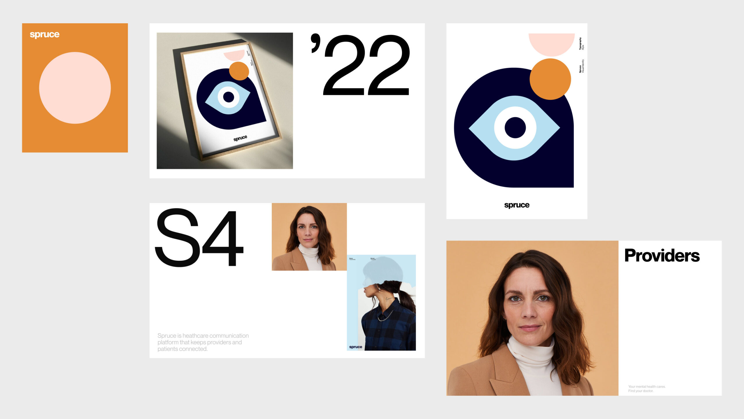
We developed a streamlined iconography set that simply and effortlessly flexes the brand’s architecture and visual scope keeping a natural balance between functionality and expression in every mark.
We developed a streamlined iconography set that simply and effortlessly flexes the brand’s architecture and visual scope keeping a natural balance between functionality and expression in every mark.
We developed a streamlined iconography set that simply and effortlessly flexes the brand’s architecture and visual scope keeping a natural balance between functionality and expression in every mark.
We developed a streamlined iconography set that simply and effortlessly flexes the brand’s architecture and visual scope keeping a natural balance between functionality and expression in every mark.
We developed a streamlined series of icon set that simply and effortlessly flexes the brand’s architecture and visual scope. Some were extremely literal, others veered more toward the abstract keeping a natural balance in every mark.

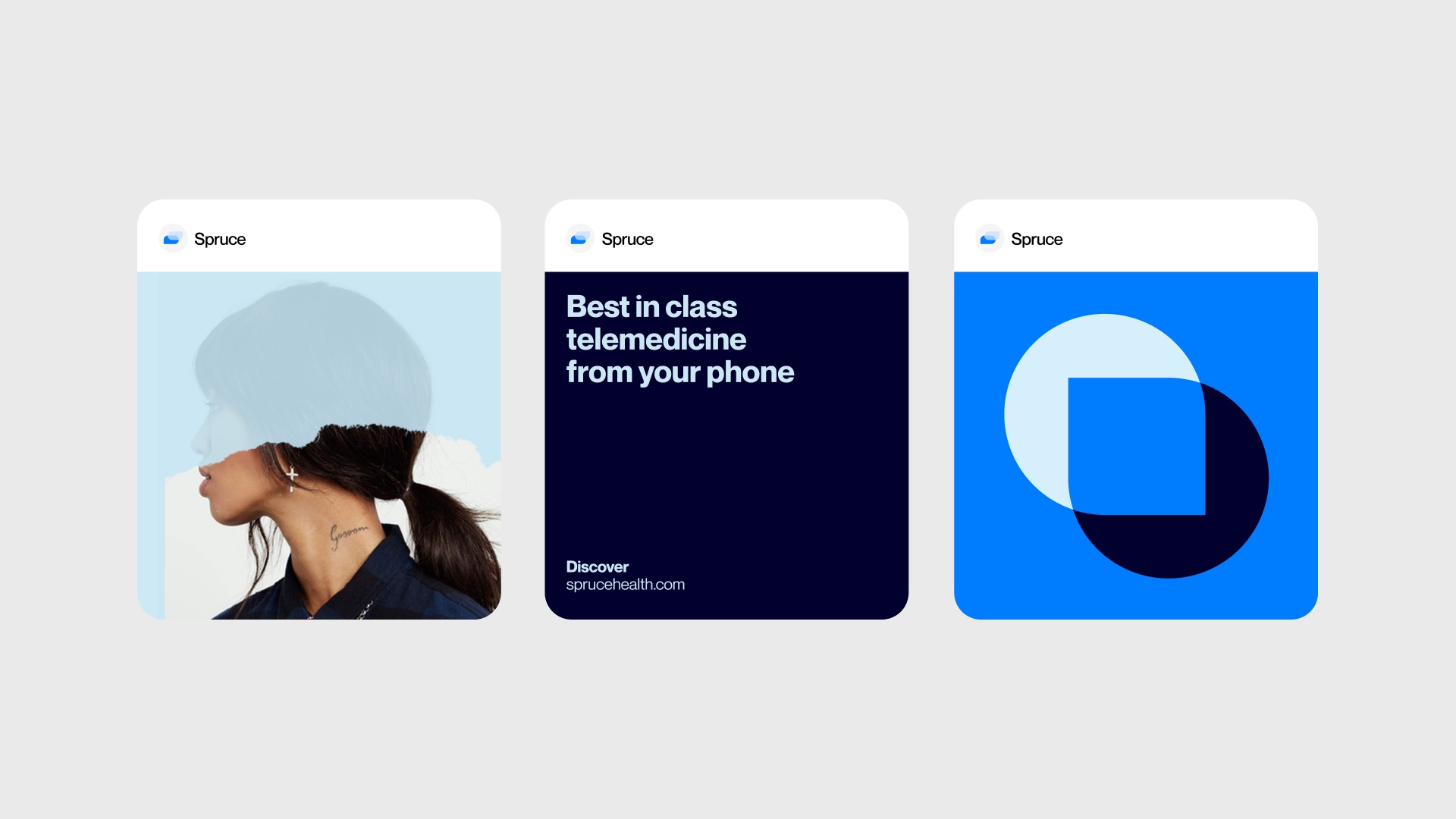
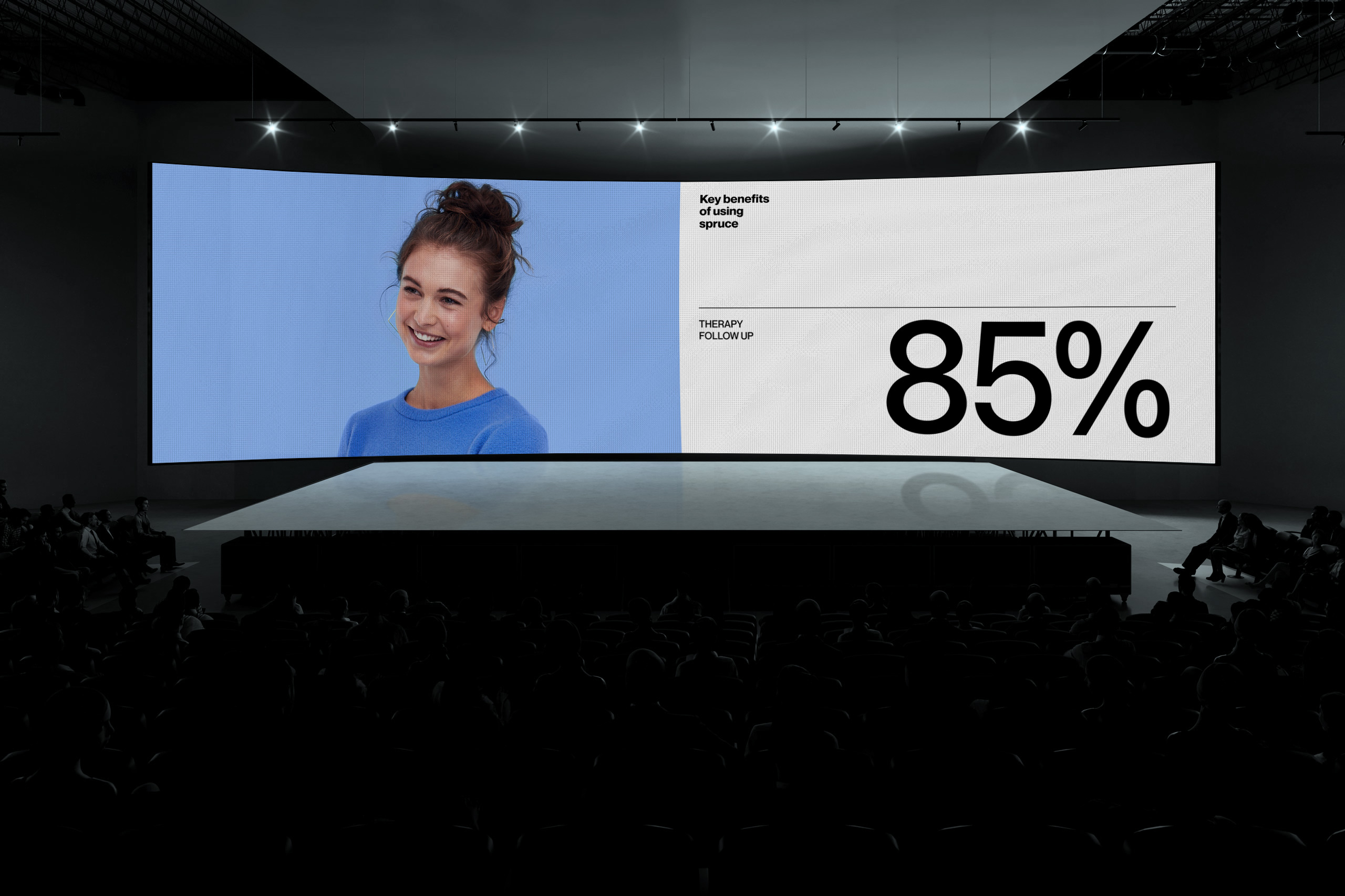
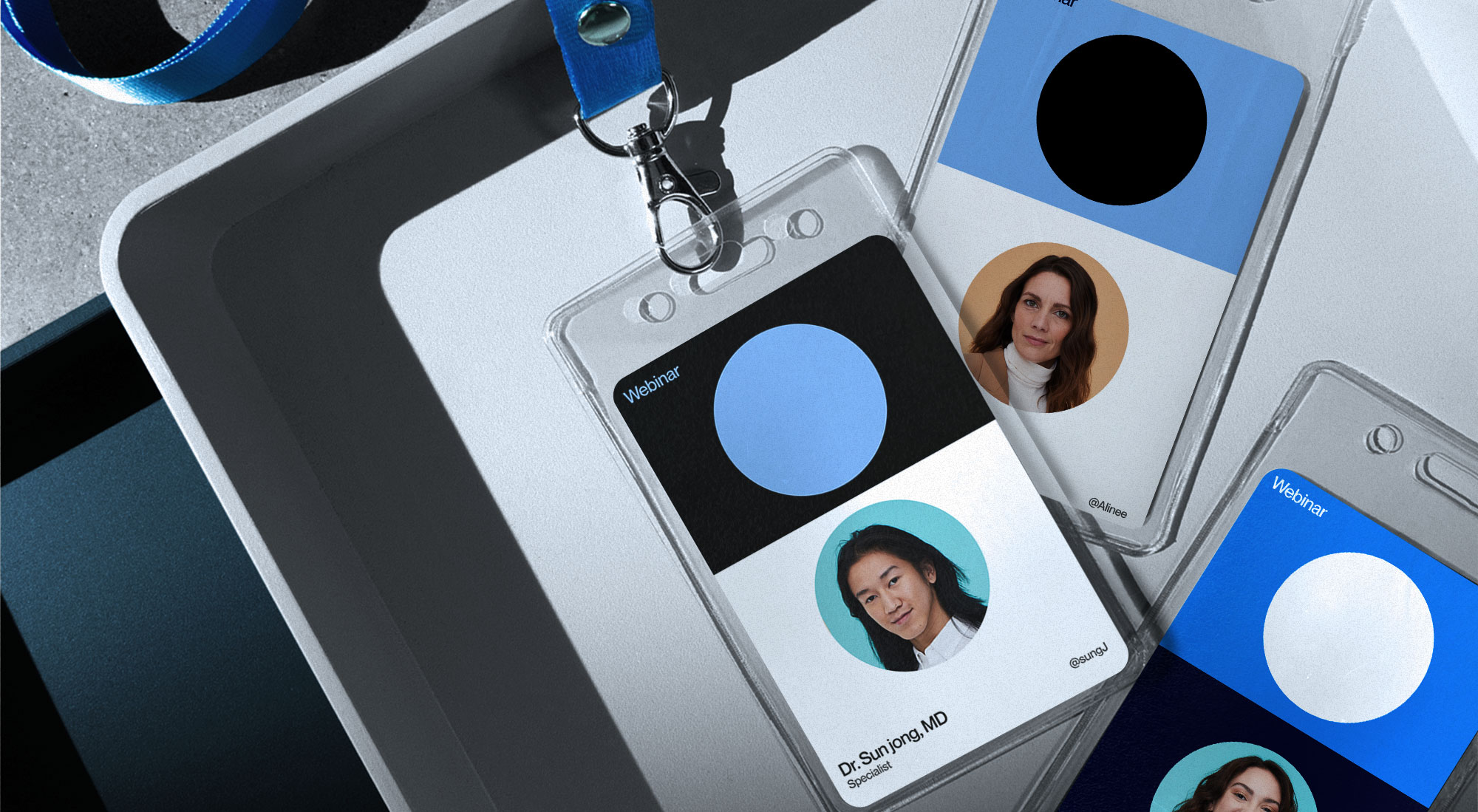
Colors play a big part of Spruce's brand. It's encapsulates the principles, trustworthy, personality and feel of spruce. To accommodate that, we have expanded the palette, pairing and adding variety and flexibility across communications for today and for the future.
Colors play a big part of the spruce's brand. It's encapsulates the principles, trustworthy, personality and feel of spruce. To accommodate that, we have expanded the palette, pairing and adding variety and flexibility across communications for today and for the future.
Colors play a big part of the spruce's brand. It's encapsulates the principles, trustworthy, personality and feel of spruce. To accommodate that, we have expanded the palette, pairing and adding variety and flexibility across communications for today and for the future.
Colors play a big part of the spruce's brand. It's encapsulates the principles, trustworthy, personality and feel of spruce. To accommodate that, we have expanded the palette, pairing and adding variety and flexibility across communications for today and for the future.
Colors play a big part of Spruce's brand. It's encapsulates the principles, trustworthy, personality and feel of spruce. To accommodate that, we have expanded the palette, pairing and adding variety and flexibility across communications for today and for the future.
WCAG (Web Content Accessibility Guidelines) ensure that content is accessible by everyone, regardless of disability or user device. To meet these standards, text and interactive elements should have a color contrast ratio of at least 4.5:1.
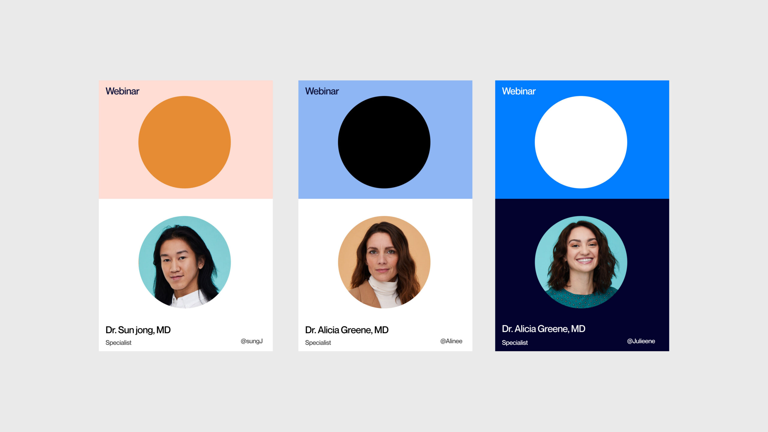


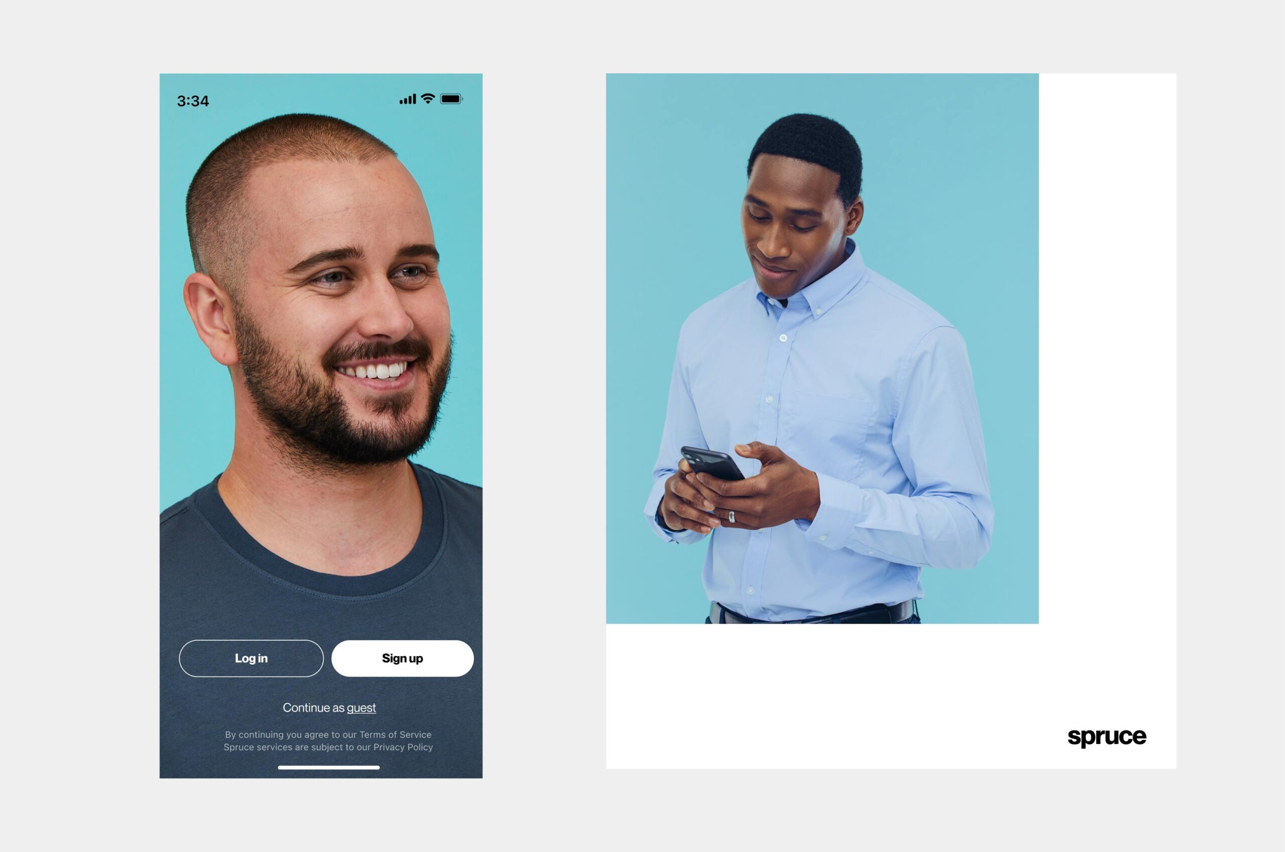

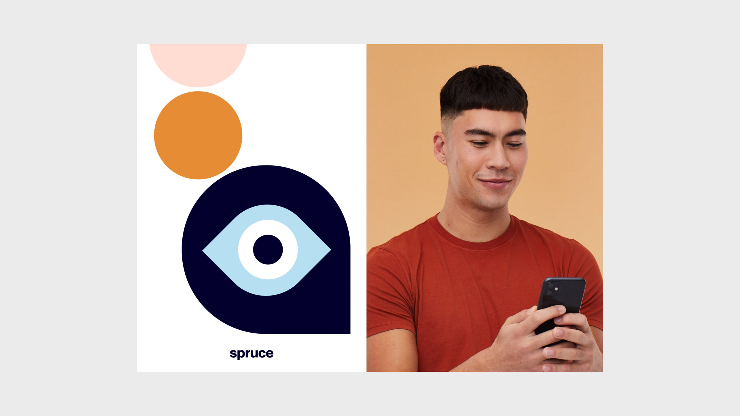
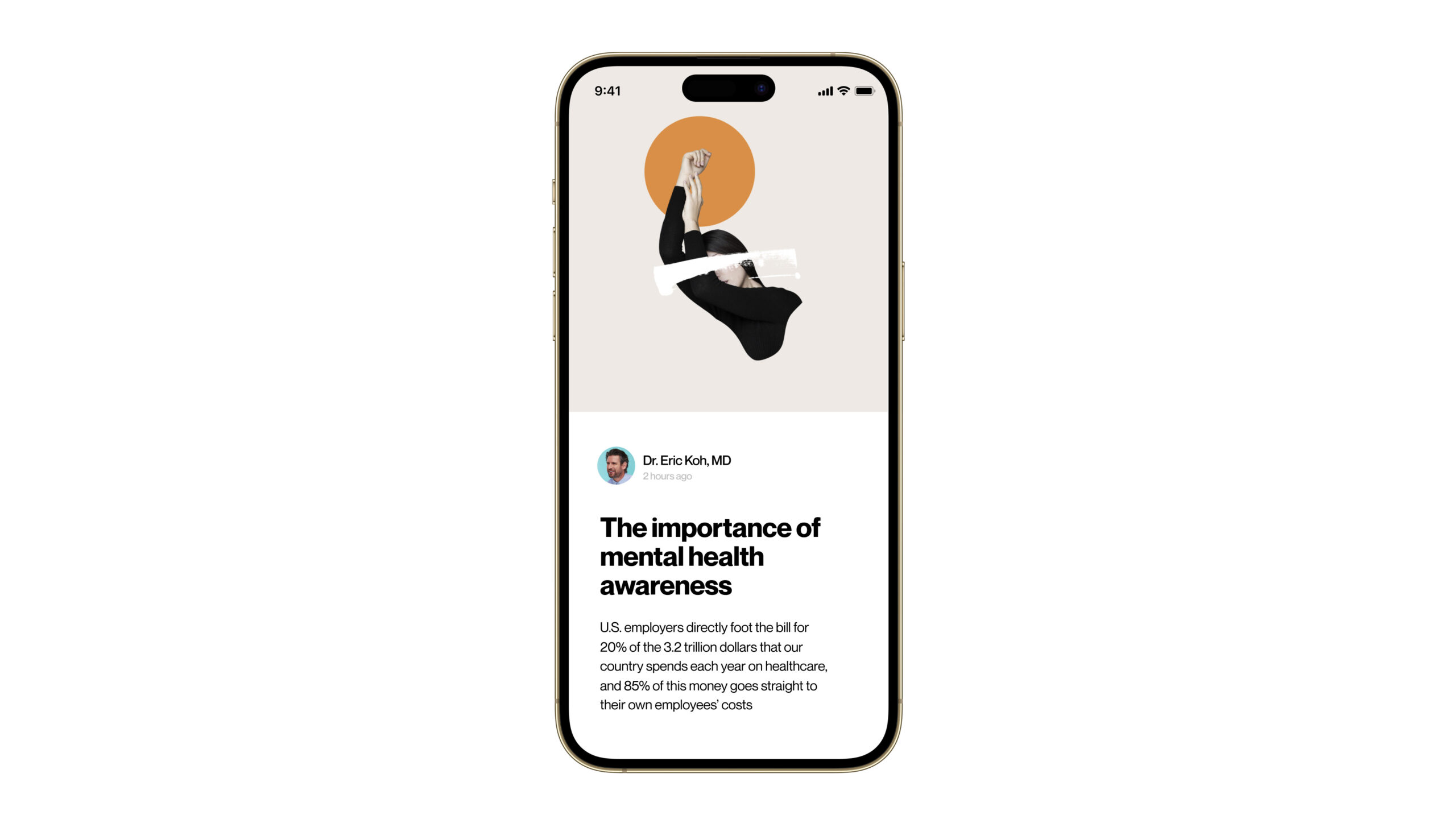
The brand photography captures the doctor and patient relationship. Providers and patients alike should come off as confident, yet lighthearted. Color in general is bright but not poppy or over saturated using tones of Spruce Brand palette adding harmonic shades.
The brand photography captures the doctor and patient relationship. Providers and patients alike should come off as confident, yet lighthearted. Color in general is bright but not poppy or over saturated using tones of Spruce Brand palette adding harmonic shades.


elvisbenicio © 2023
elvisbenicio © 2022
© 2022